· Luisa Zeppelin · Case Study · 3 min read
CONNECT BY YERUN: AI-powered research collaboration platform
A data-driven web app that recommends collaborations and funding opportunities for YERUN researchers

· Luisa Zeppelin · Case Study · 3 min read
A data-driven web app that recommends collaborations and funding opportunities for YERUN researchers
Project: CONNECT BY YERUN
Role: Data Scientist, Frontend Developer, UX Designer
Client: SDU RIO, University of Southern Denmark
Context: A data-driven platform for 23 YERUN member universities, enabling researchers to discover collaborations, funding opportunities, and publications.
Outcome: A scalable, AI-powered web app that simplifies complex data through hierarchical clustering and interactive visualizations.
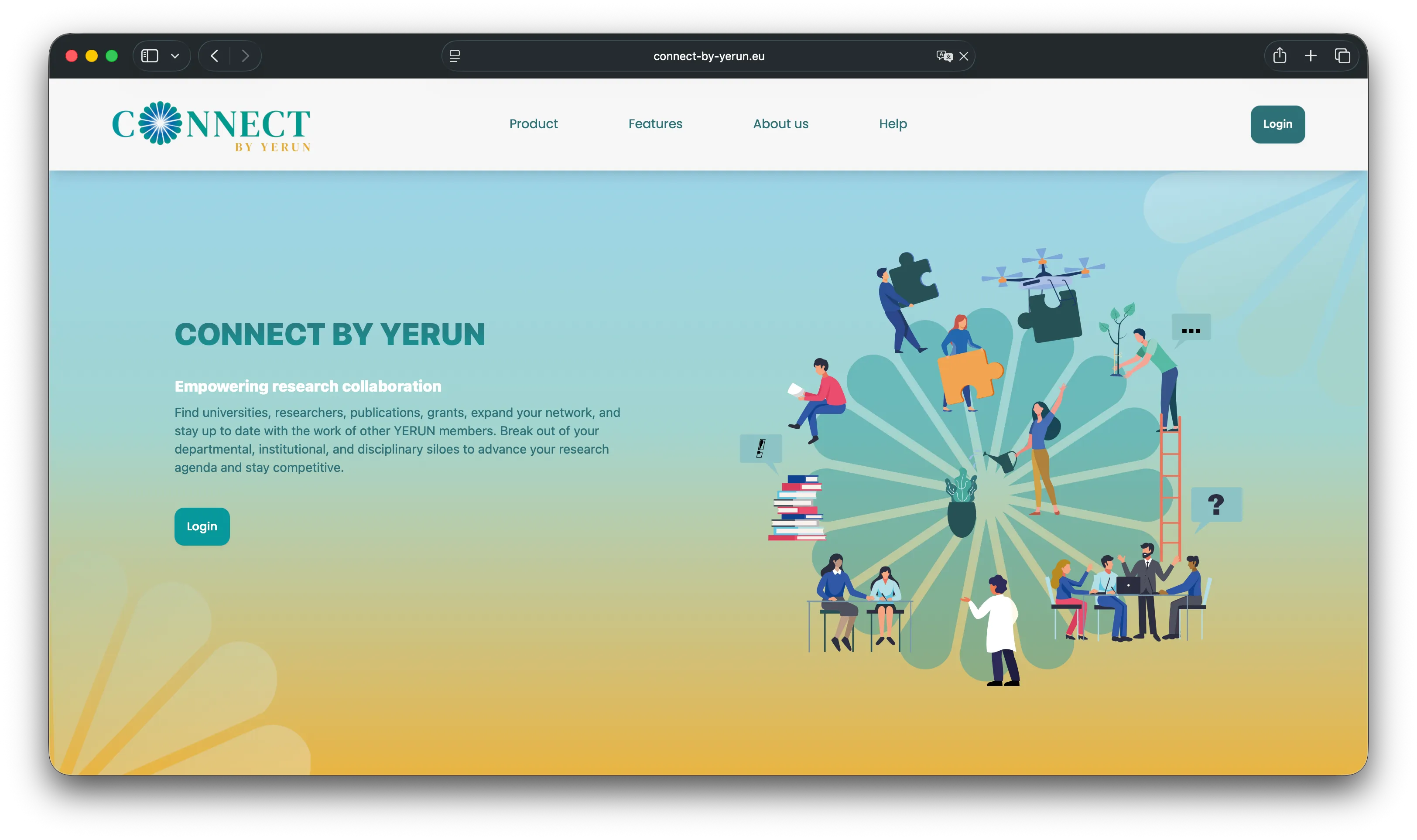 The landing page of CONNECT BY YERUN, designed to foster research collaborations.
YERUN (Young European Research Universities Network) required a platform to empower researchers in their network to:
The core challenge: The sheer volume of publications (thousands of entries) made it nearly impossible for users to manually scan and find relevant content. The platform needed a way to organize and visualize this complexity to navigate the publications intuitively by topic.
Since CONNECT BY YERUN shares a similar purpose to WaveLinks, I reused the Figma design from WaveLinks as a starting point, adapting it to YERUN’s branding and needs. This ensured consistency while accelerating the design phase.
👉 See my post on WaveLinks: A web platform fostering collaboration and knowledge-sharing for ocean restoration
To make the publication database manageable, I developed a multi-layered clustering pipeline using NLP and LLM technologies:
Hierarchical clustering:
Automated topic naming:
Pipeline optimization:
Technologies used: Python, Concurrent.futures, Joblib, Asyncio, LDA Modeling, Ollama Python Client, JSON Handling (orjson).
To make the clustered data user-friendly, I designed a custom interactive visualization using React and D3.js:
Hierarchical diagram:
Technical implementation:
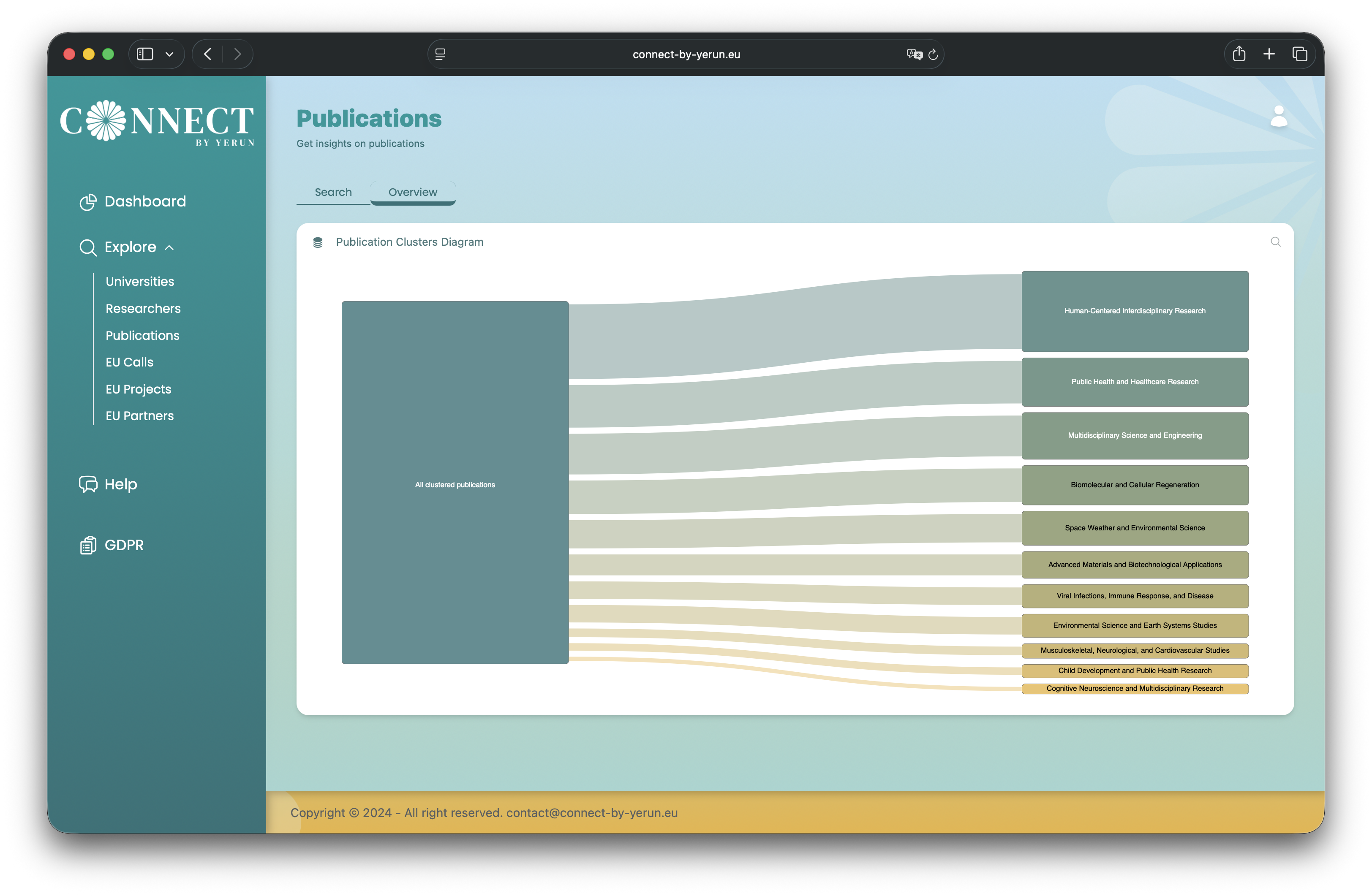
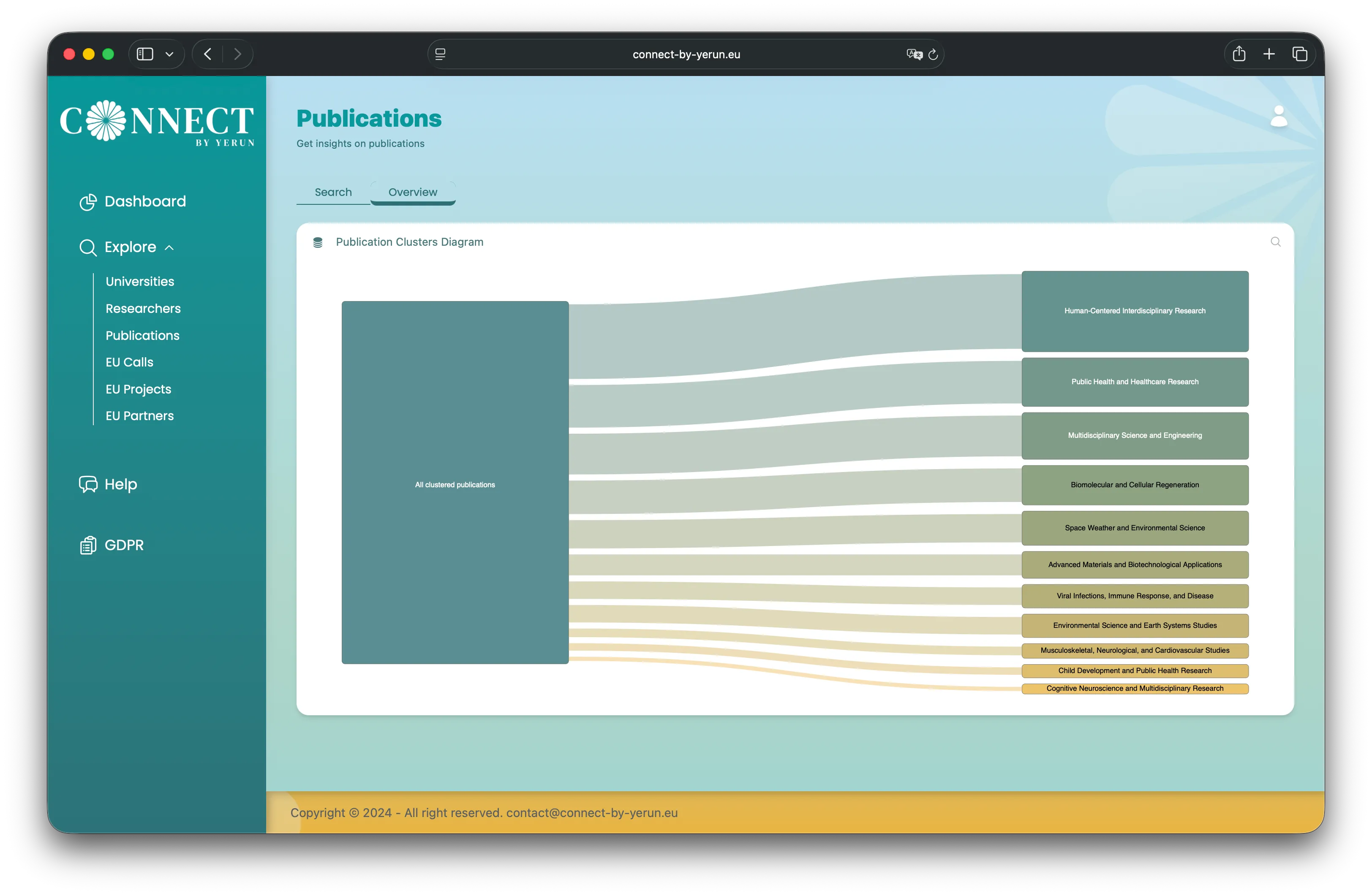 The interactive D3.js diagram, allowing users to explore hierarchical topic clusters.
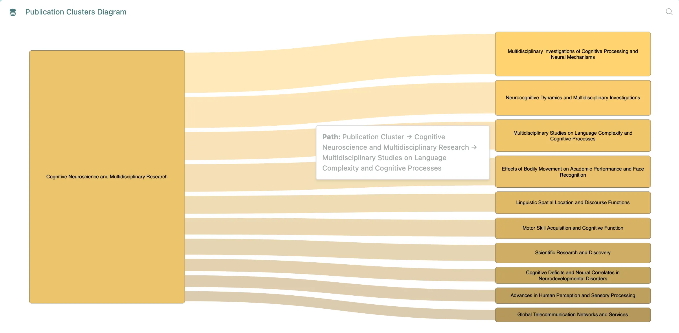 Subtopics are available and explorable. Here, the tooltip shows the hierarchy of topic clusters.
| Feature | My Role | Impact |
|---|---|---|
| Hierarchical clustering | Designed and implemented the NLP pipeline | Made thousands of publications navigable |
| LLM topic naming | Integrated Ollama for automated naming | Improved usability with human-readable labels |
| Interactive visualization | Built the D3.js/React component | Enabled intuitive exploration of complex data |
| Reusable design | Adapted WaveLinks’ Figma design | Accelerated development and ensured consistency |
| Optimized pipeline | Implemented multiprocessing and async | Handled large datasets efficiently |
CONNECT BY YERUN is now a live platform that:
The platform is especially useful to researchers from YERUN’s 23 member universities. However, all researchers with an ORCID ID can log in.
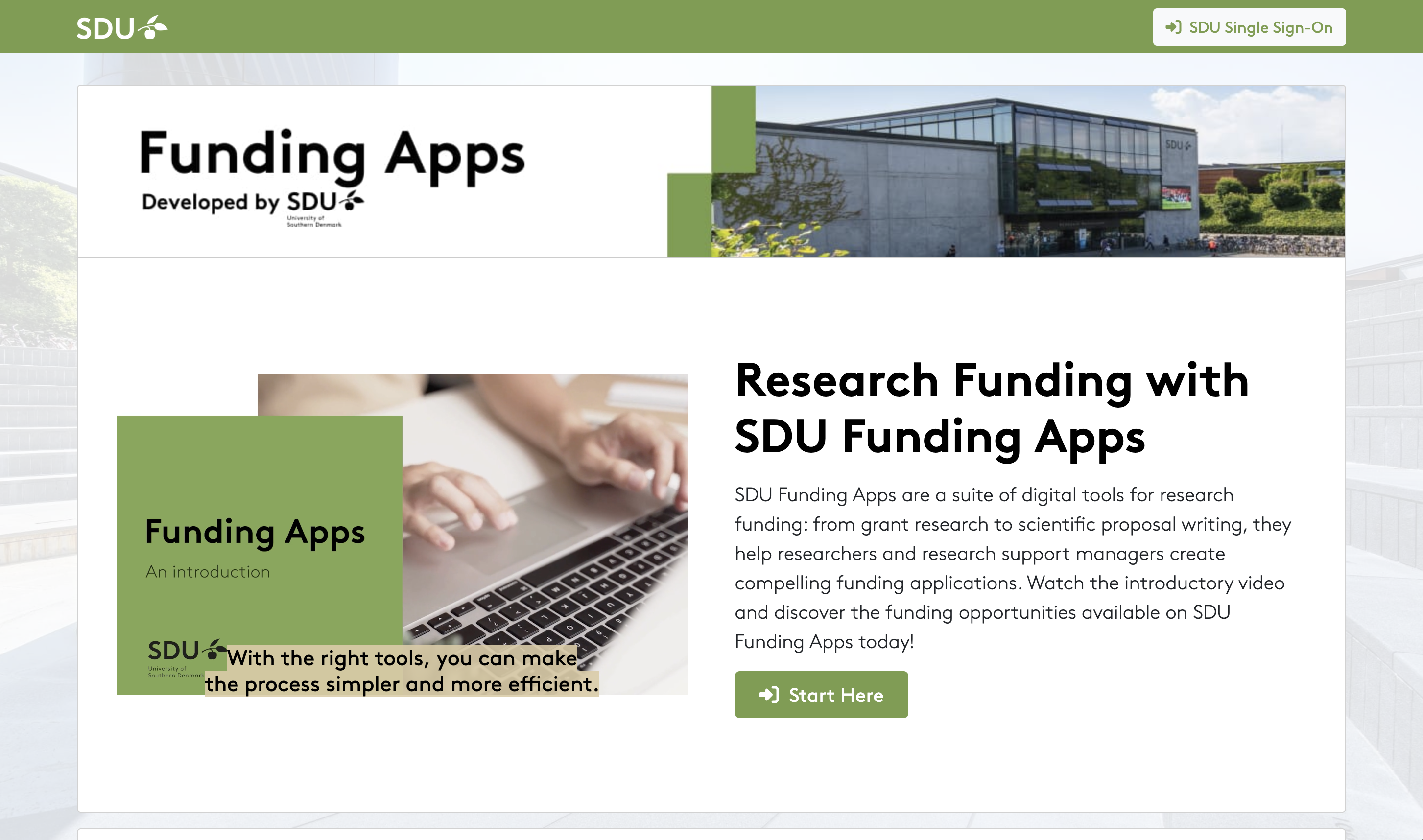
A suite of digital tools for research funding, now adopted by universities across Denmark
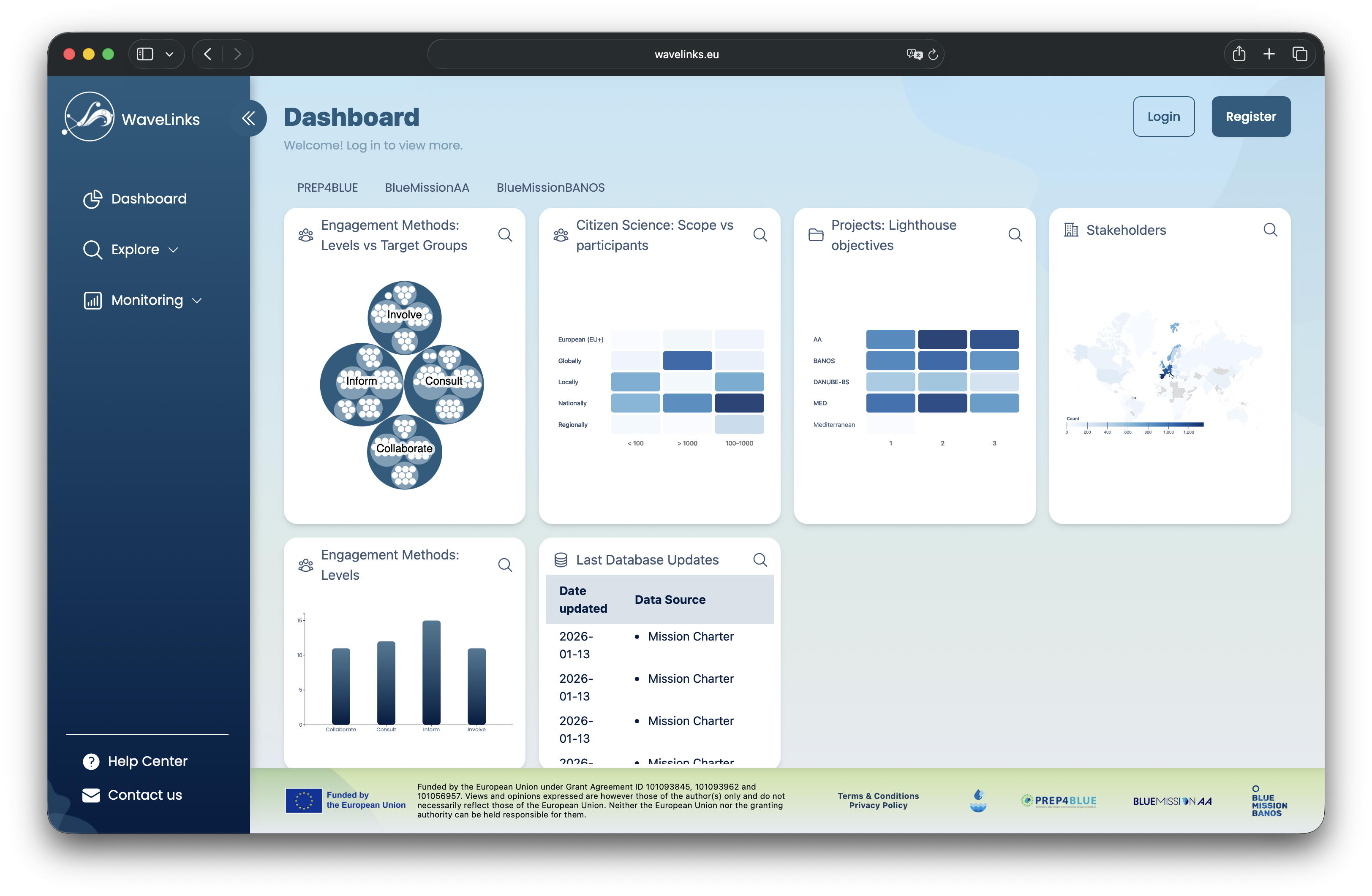
A web platform fostering collaboration and knowledge-sharing for ocean restoration
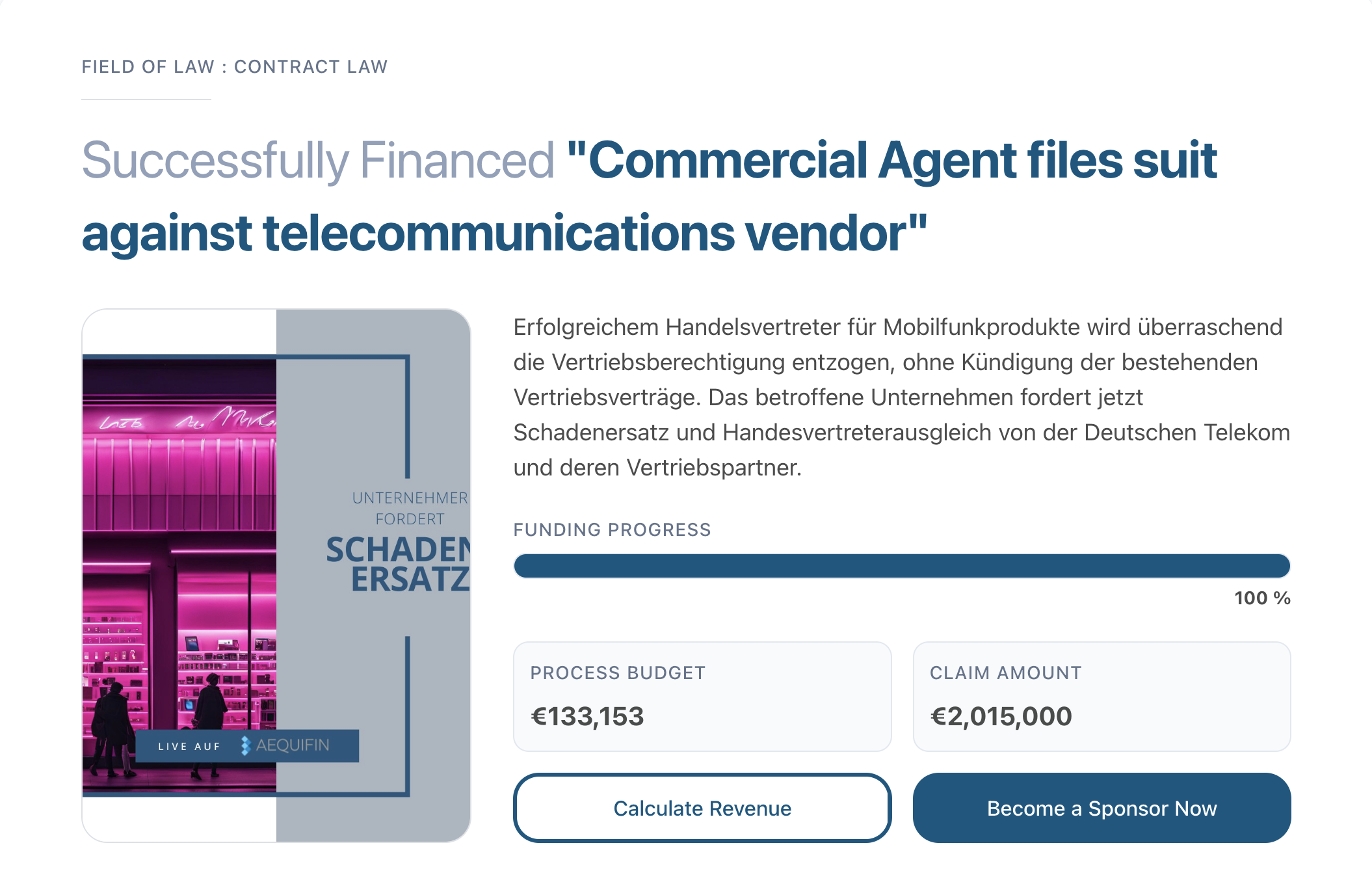
A unified template for scalability and user engagement